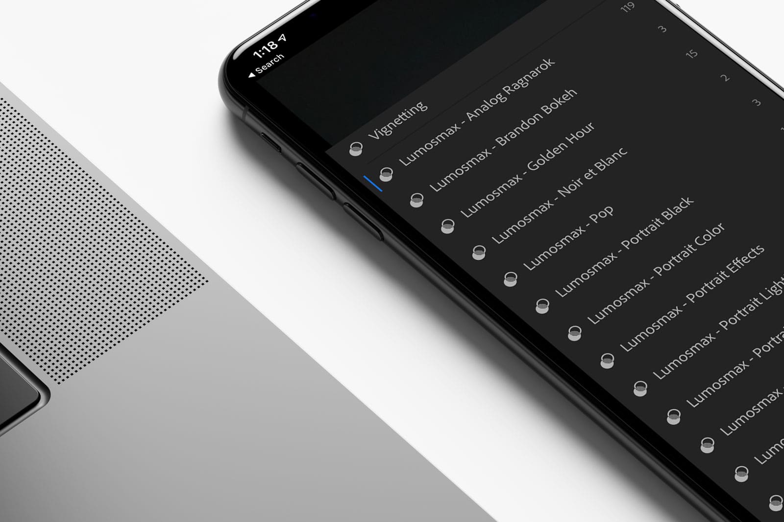
The Creative Director, Hanif, unveiled the all new icon for the company. The Lumosmax Logo was revealed for the first time ever during the quarterly earnings report meeting held in Shah Alam earlier today.
As Hanif puts it “The logo features a mysterious hooded figure ‘Lumosmaxing’ the clients”. It is corporately casual and yet unapologetically aesthetic.
The logo accentuates the Golden Ratio which seamlessly proportionates to 1.61803. This is also known as the Divine Proportion.
Why does it matter?
Some of the greatest artists and architects in the twentieth-century including Dalí and Le Corbusier have proportioned their works to approximate the golden ratio; it is said to both tangibly and intangibly defining perfection when it comes to design and engineering.
How does it work? Let’s do the math.
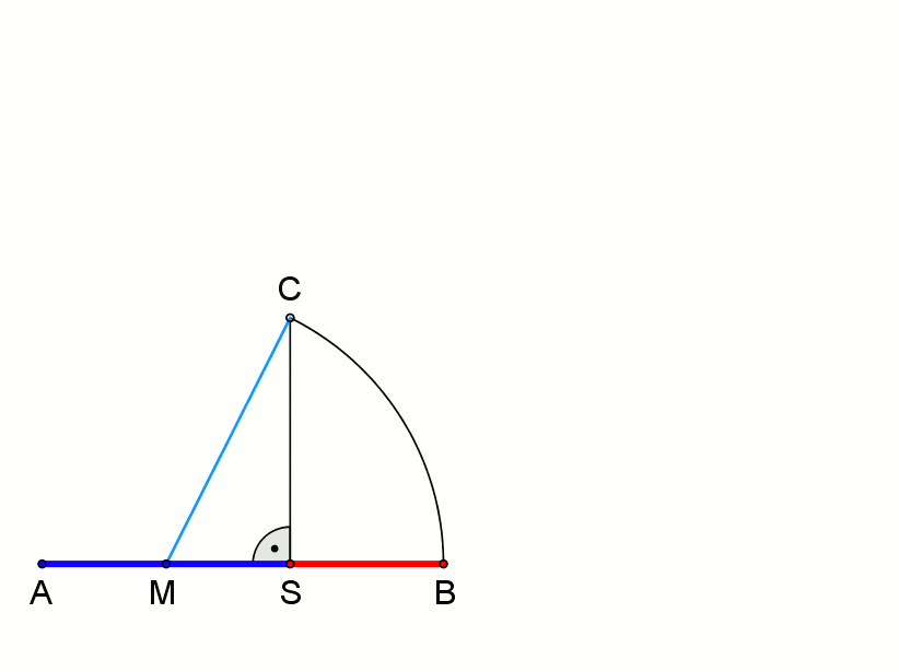
Basically two quantities a and b is said to be in the golden ratio if a+b/2 is equal to a/b = φ. Math geniuses and graphic designers out there, if you have a better way of explaining this in a human language please write them down in the comment box below. In brief, designs with the divine proportion in many situations are proven to look better than designs that do not follow the proportion. Do all designers agree with this? Nope, but one thing for sure; the Lumosmax Logo is simply ‘World Class’.